For NPO Start, a video-on-demand service, I challenged the status quo and came up with a better way to browse and discover movies
Introduction
Challenge
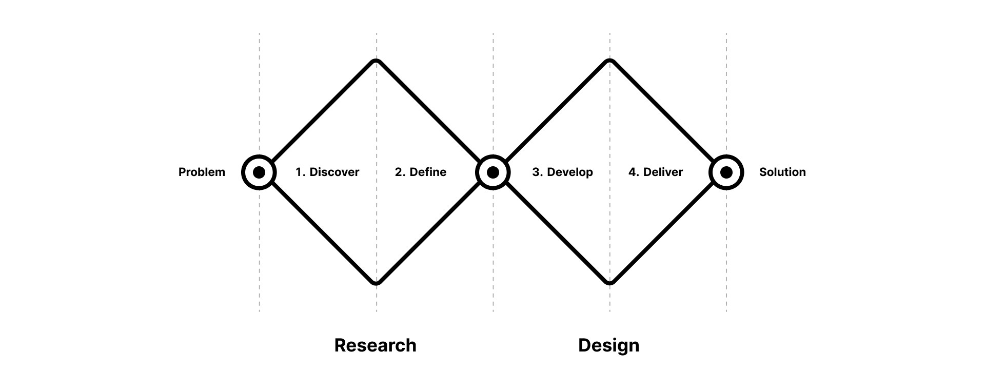
Approach
Understanding movie data-attributes
I began by inspecting the movie data-attributes tied to each movie card on the NPO Start platform using the browser's developer tools. This analysis was crucial for discovering and identifying what information is available and how it's structured.
Studying best practices
Next, I looked at other streaming platforms to discover potential solutions. A competitor analysis revealed best practices and approaches to similar user needs. Combining this research with my understanding of NPO's movie data-attributes, I sketched ideas to enhance the user experience.
Finding a better way
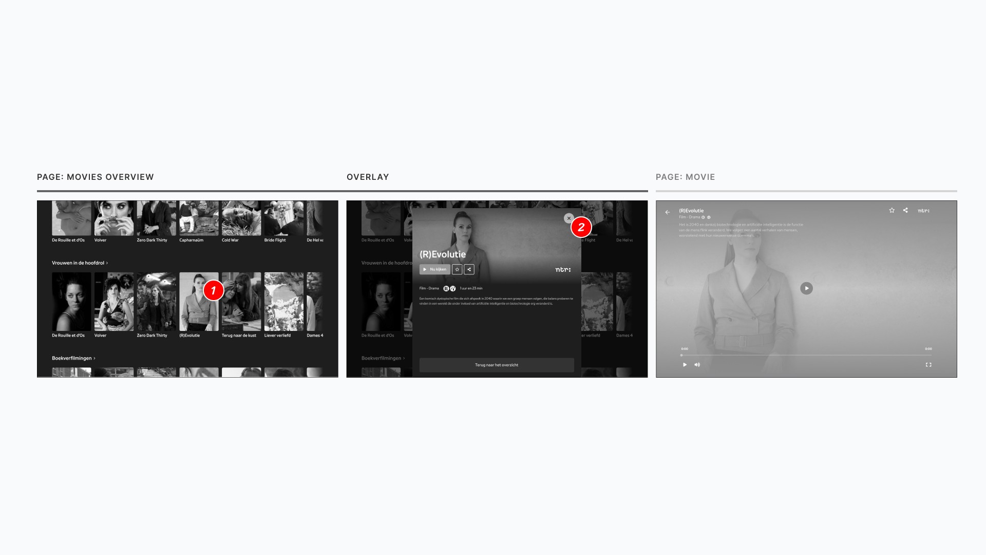
With the insights from studying movie data-attributes and analysing competitors, I was ready to redefine the user flow. Below are images comparing the 'before' user flow and the 'after'. The new flow speeds up browsing and improves movie discovery.

Before: It took four (4) clicks to go back-and-forth between the movies overview page and the full movie description. This, coupled with the added wait time from page loads, was not only time-consuming, but also really frustrating.

After: Bringing down the clicks from four to two (2), that's half the effort. This component appears on the movies overview page, making browsing quicker and more satisfying for users. Plus, it helps the business by reducing server load.
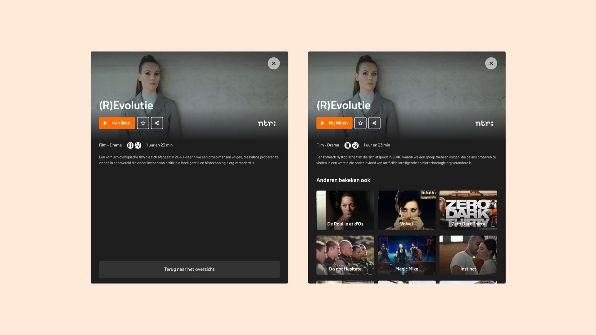
New overlay component
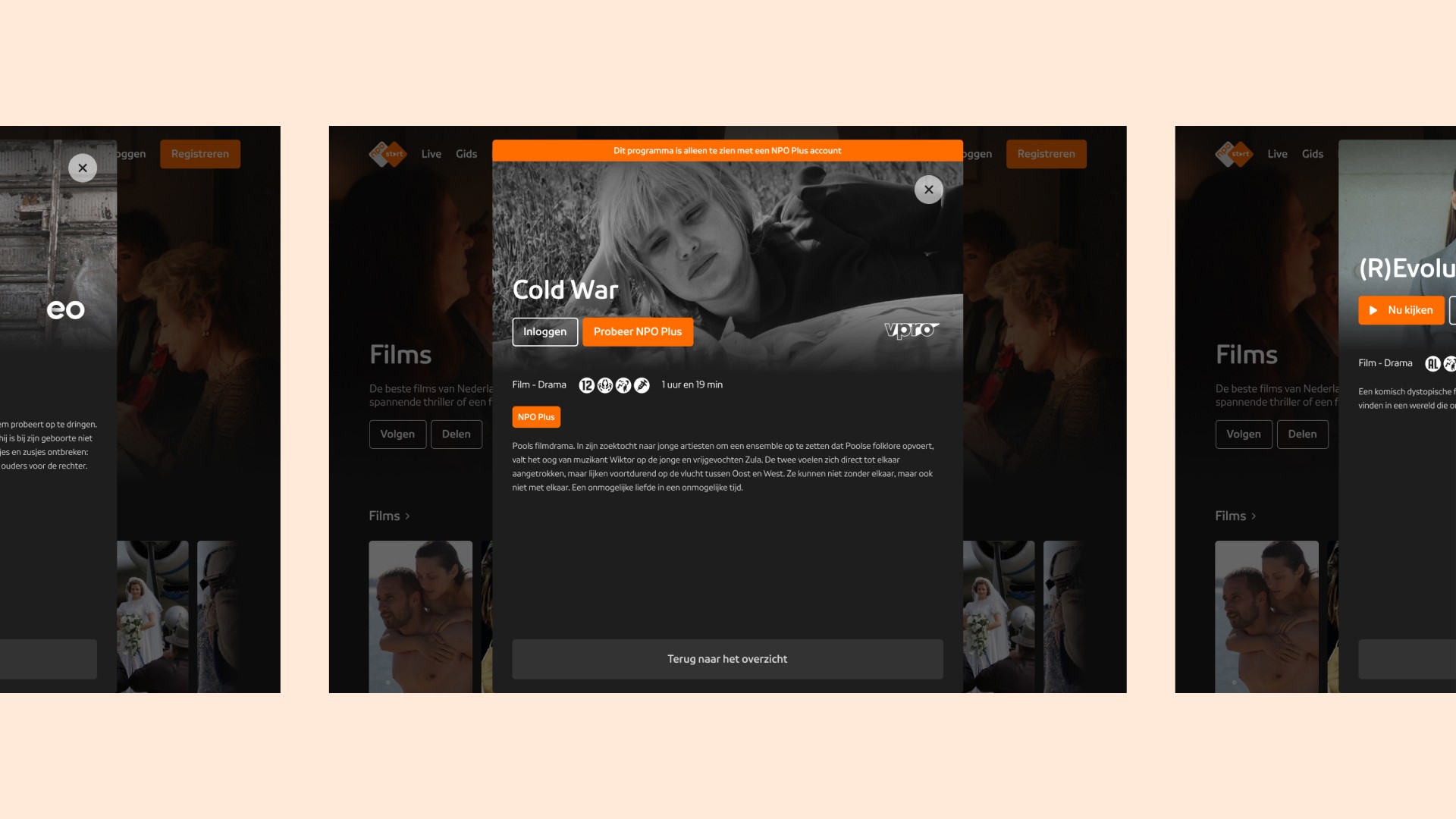
Building on the insights from the research phase, I created an overlay component. It reduces clicks and keeps users on the movies overview page for a seamless discovery experience. The component's scalability allows for adding new sections like 'Others also watched', and/or the ability to expand movie summaries with even more details.


Results
The new design has significantly improved the browsing experience on NPO Start. I've cut the clicks in half, from four to just two. This means users can navigate the site with half the effort. Also, by keeping users on the movies overview page, I've removed unnecessary page loads. This makes navigation faster and more enjoyable, while also lightening the load on the servers.
But these improvements aren't assumptions that can be left untested - they need to be validated with real users. If necessary, I'm ready to make further changes based on user feedback. This project has been a great learning experience, showing how thoughtful design can significantly improve user experience and engagement.

