For Soley, a company focused on cleaning and facility services, I updated their brand identity and website, providing a professional look and feel to support its growth
Challenge
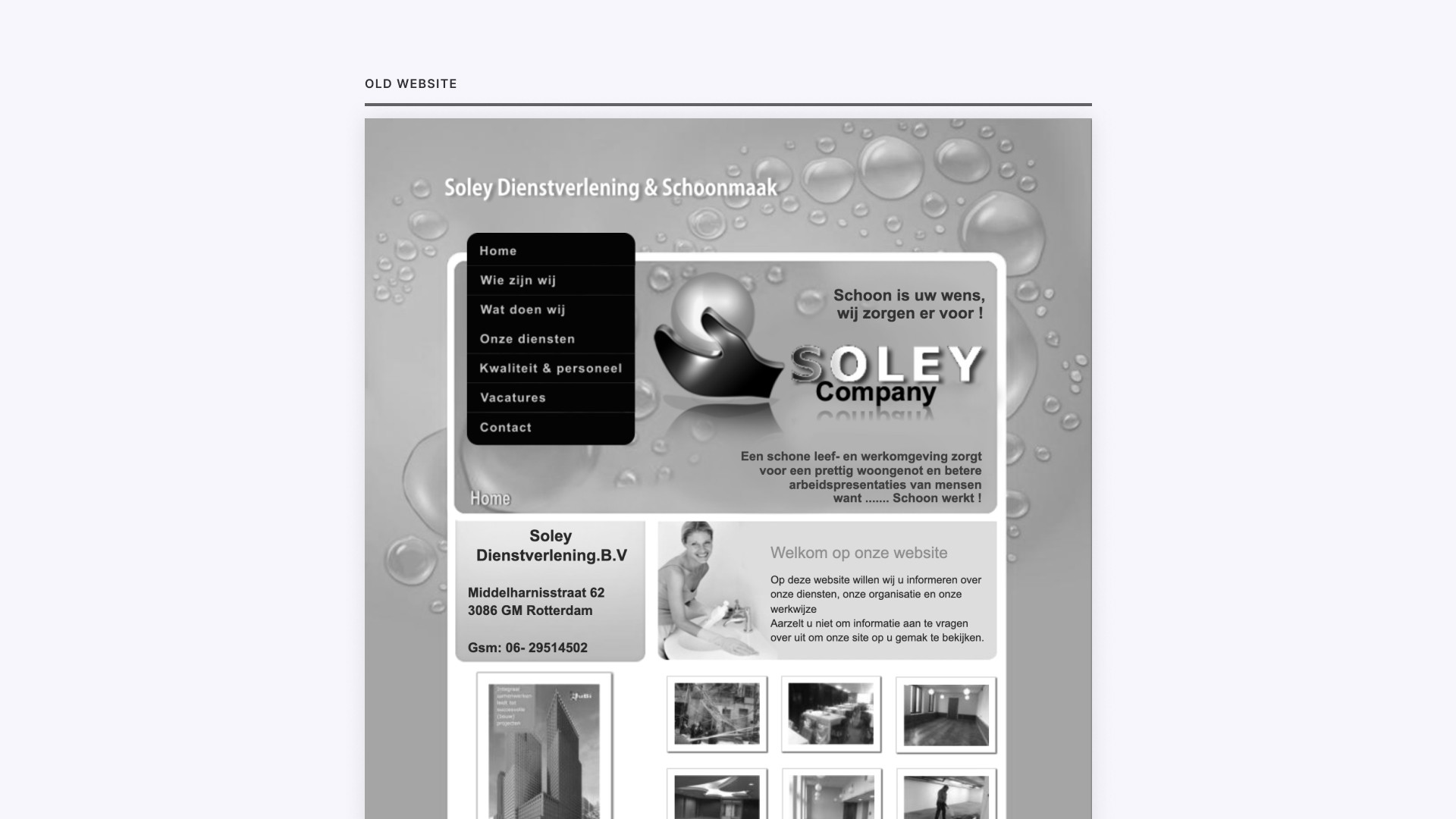
Soley's existing brand and website needed a significant update. To put it plainly, the existing website was outdated, lacked consistency, contained poor and incorrect grammer, and didn't adapt to different devices. In a nutshell, it didn't reflect what Soley was all about. Soley handed me a blank canvas and trusted in my skills to reimagine their brand and help them to tackle these issues.
Logo
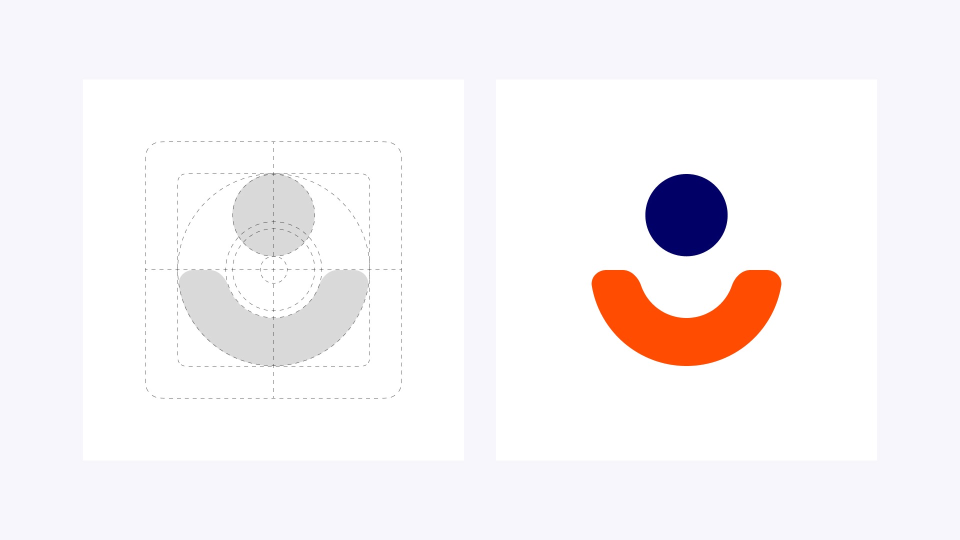
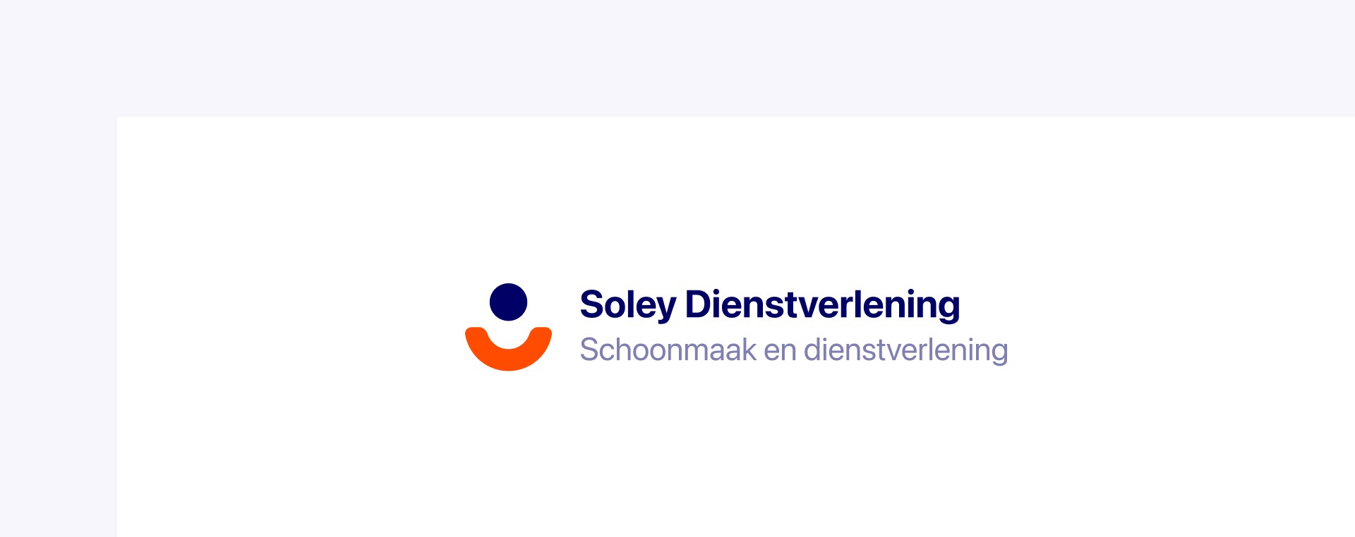
Although I was handed a blank canvas, I wanted the new logo to reflect a sense of familiarity to the old one, yet carry a fresh vibe. So, while sketching my ideas, Soley was pleased with the direction I took and decided to move forward with the following logo design.
Setting up the style guide
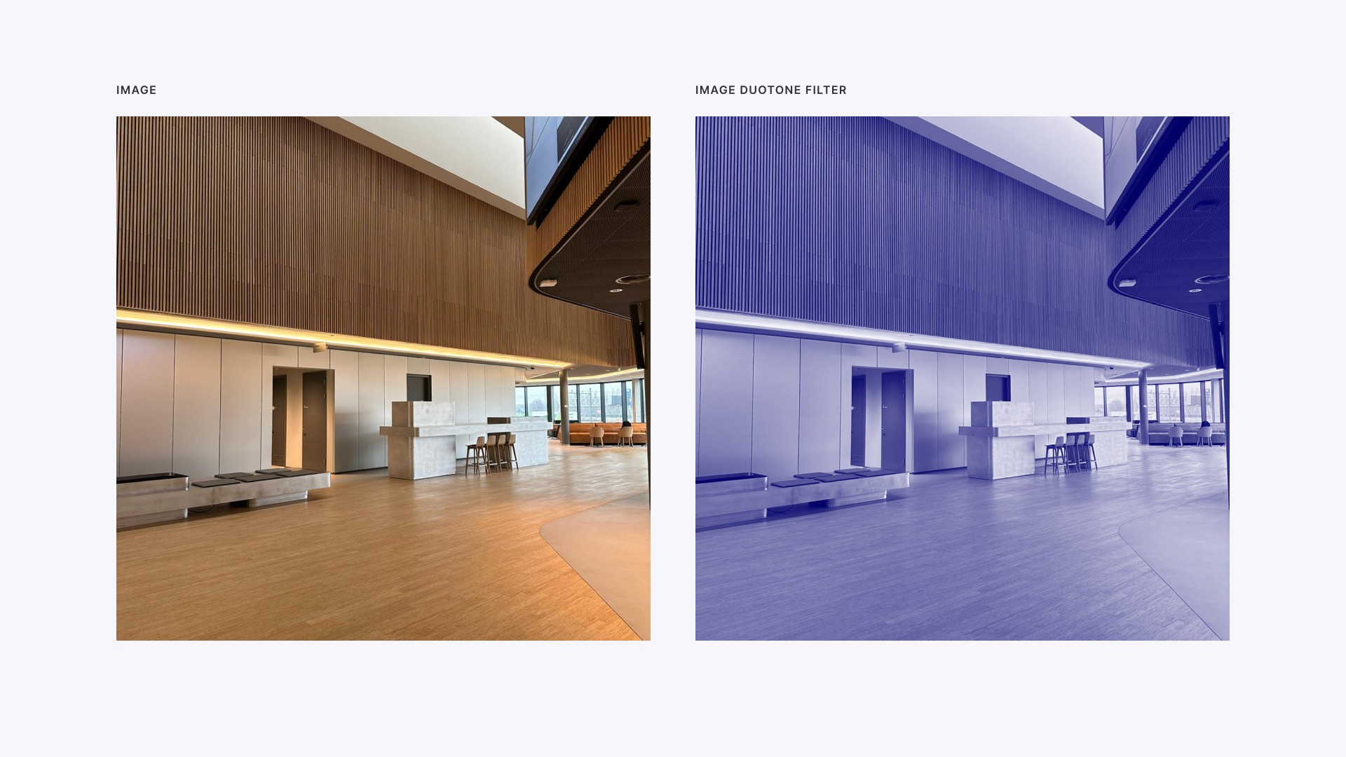
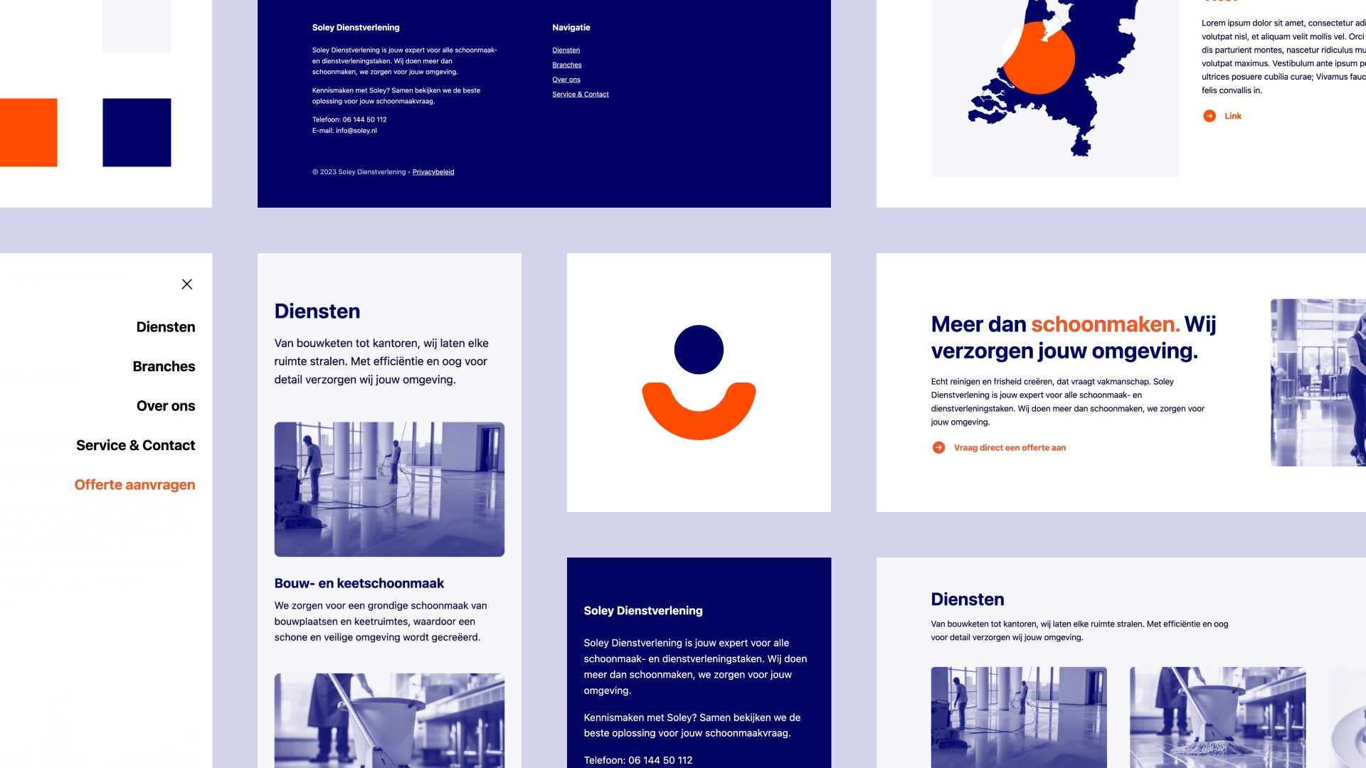
Before diving into the website design, I needed to lay a solid base with a few key deliverables. I started off by choosing a color palette that has a professional look and feel to it. To ensure a unified look across the site, I decided to use a duotone filter for the images. This happened to be a real time-saver, as I didn't need to hunt for the perfect images. The next step was typography, where I created a type scale to keep the look consistent across all pages.

The core message
Good copy is crucial for any website. Even though I'm not an expert on copywriting, I understand the value of well-crafted words. So, when Soley asked for help on this topic, I suggested we try something new – AI tools like ChatGPT.
The main objective here was to come up with a core message for Soley's brand. We put our heads together in a brainstorming session, threw ideas back and forth, and landed on a message that perfectly aligned with the business, which was: "More than cleaning, we care for your environment."

Website
After setting the previous deliverables, I moved on to design and develop a user-friendly website with an appealing interface. I designed reusable content blocks for site-wide consistency, and applied a duotone filter on images that provided a more cohesive look. I made sure the site works flawlessly on all devices for a seamless user experience. The result? A professional and intuitive, yet straightforward website that aligns with the ambitions Soley had set for.

Results
My work gave Soley a new, up-to-date look. I fixed their old website's problems, making it easy to use and error-free in terms of grammer. The brand message, "More than cleaning, we care for your environment," shows clearly what Soley stands for. It helps Soley speak to their customers and build trust. Now, Soley has a brand and website that they’re proud of, and that match their ambitions.
