For the University of Amsterdam, I conducted a usability study on the new student portal, increasing its usability by 32% and user happiness by 50%
Challenge
The challenge involved understanding how international students interact with the new portal via usability testing. The objective was to see if international student could efficiently and successfully handle essential tasks, with a strong focus on visa/immigration application and housing application, while still being satisfied with the process.
Approach
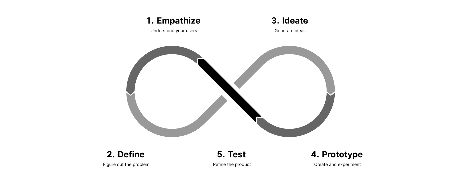
For this project, I used the Design Thinking method. It's a human-centered, iterative process, making it perfect for a usability-focused project like this. This approach allowed me to understand these international students, identify their requirements, brainstorm solutions, create prototypes, and evaluate their ease of use, all while continually refining the portal based on user feedback.
The questions I needed to answer were: "What are the most important tasks that international students need to do on the MyInfo portal?", "How easy is it for someone using it for the first time to find their way around?", "Where do users have problems, and why?" To find the answers to these questions, I used a combination of methods such as interviewing students, task analysis, heuristic evaluation, and usability testing.

Understanding international students
I started by examining survey results provided by UvA and conducting in-depth interviews to comprehend the needs of international students using MyInfo. These insights helped me create accurate user personas and scenarios. These personas became the foundation of the usability study and guided the design improvements.
Defining the metrics
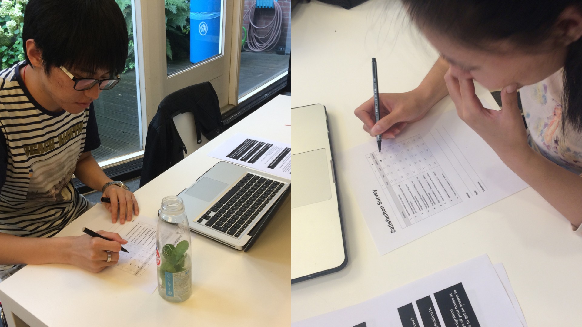
Researching and planning were vital parts of the project. I set up structured usability tests, carefully planned each phase, and identified key metrics such as task completion rate, error rate, and user satisfaction. These metrics were essential to measure the impact of design changes on the user experience.
Usability testing
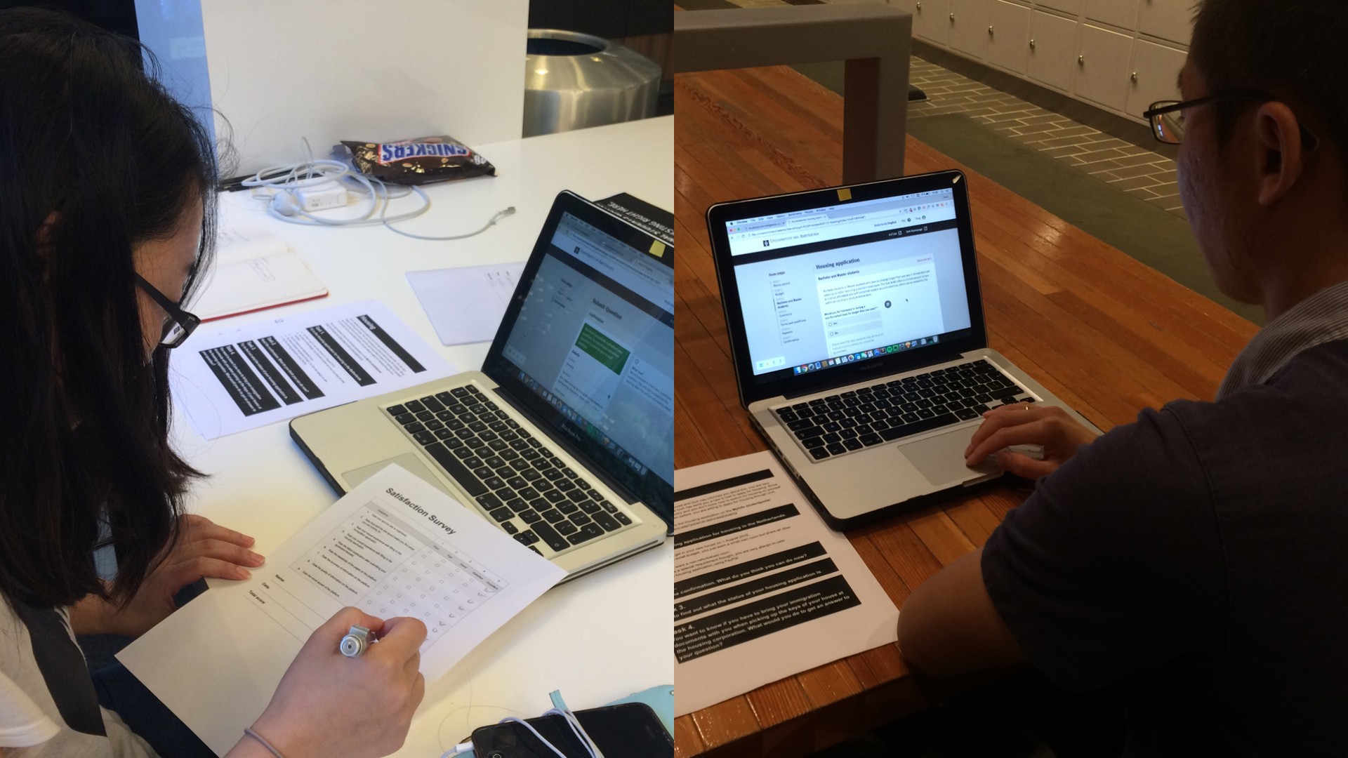
With the usability tests, I put the user personas and scenarios to work. Observing and recording how users interacted with the portal, I gathered valuable feedback. This feedback became the catalyst for iterative design enhancements based on real user experiences.


Results
When I compared the initial design with prototype 3, it was clear that the MyInfo portal had significantly improved. It was 32% more efficient and effective, which means students could finish tasks faster and with fewer mistakes. Plus, student satisfaction, an important measure of user experience, jumped by 50%. This showed me that students found using the updated portal easier and more pleasant.

