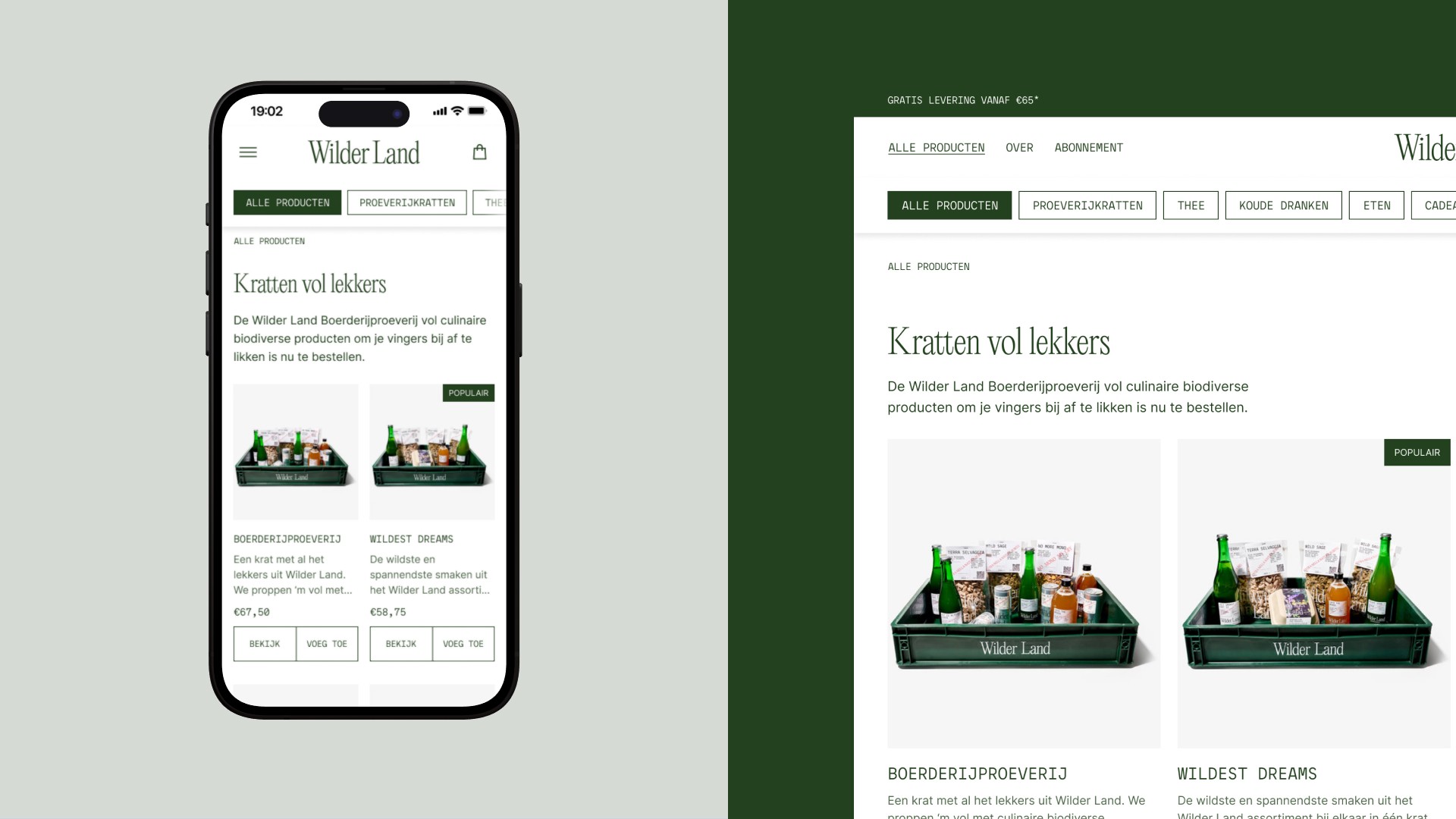
For Wilder Land, a Dutch company on a mission to restore nature, I optimised the e-commerce website to enhance the online shopping experience
Introduction
Wilder Land, a Dutch company, is on a mission to restore nature and enhance biodiversity. By forging close collaborations with local farmers, they source and offer products crafted from local and native plants. Starting as an e-commerce website primarily selling tea, their expansion led to a broader range of products. However, this growth came with a challenge—a noticeable dip in the website's conversion rate. Trying to understand this decline and eager to find optimisation solutions, they reached out to me for expertise to enhance their online shopping experience.
Approach
The journey began with gaining a thorough understanding of Wilder Land as well as its website visitors and existing customers. This process involved having discussions with one of the two founders of Wilder Land, analysing both qualitative and quantitative data using tools like Google Analytics and Hotjar, and conducting an expert review. Considerable data was collected from surveys and feedback polls filled out by customers and website visitors. This data offered a look into user behaviours, needs, and challenges they faced on the site. Tracing customer journeys through Google Analytics helped identify the most visited pages and the points where users tended to leave.
Using the data, a user persona was created that captured the typical user's needs, behaviours, and challenges, serving as a valuable reference for understanding the user-centric issues at hand. The insights revealed a need for improvement in several functionalities and pages, specifically, the structure of the homepage, the navigation, and the product categories pages.
With a clearer understanding and gathered insights, I set out to translate these into concrete actions. I defined design principles and formulated hypotheses to guide the next steps, making sure that both Wilder Land and I were on the same page.
Design principles
Scalability
Ensuring the website is future-proof to accommodate Wilder Land's ambitious growth plans and expanding product range.
Navigation
Creating an intuitive, user-friendly environment so customers can explore and find what they're looking for.
Consistency
Making sure the online presentation aligns with Wilder Land's physical product branding.
Human connection
Highlighting local landscapes and featuring hardworking farmers to connect the brand with its core audience, underscoring its mission and values.
Homepage and navigation update
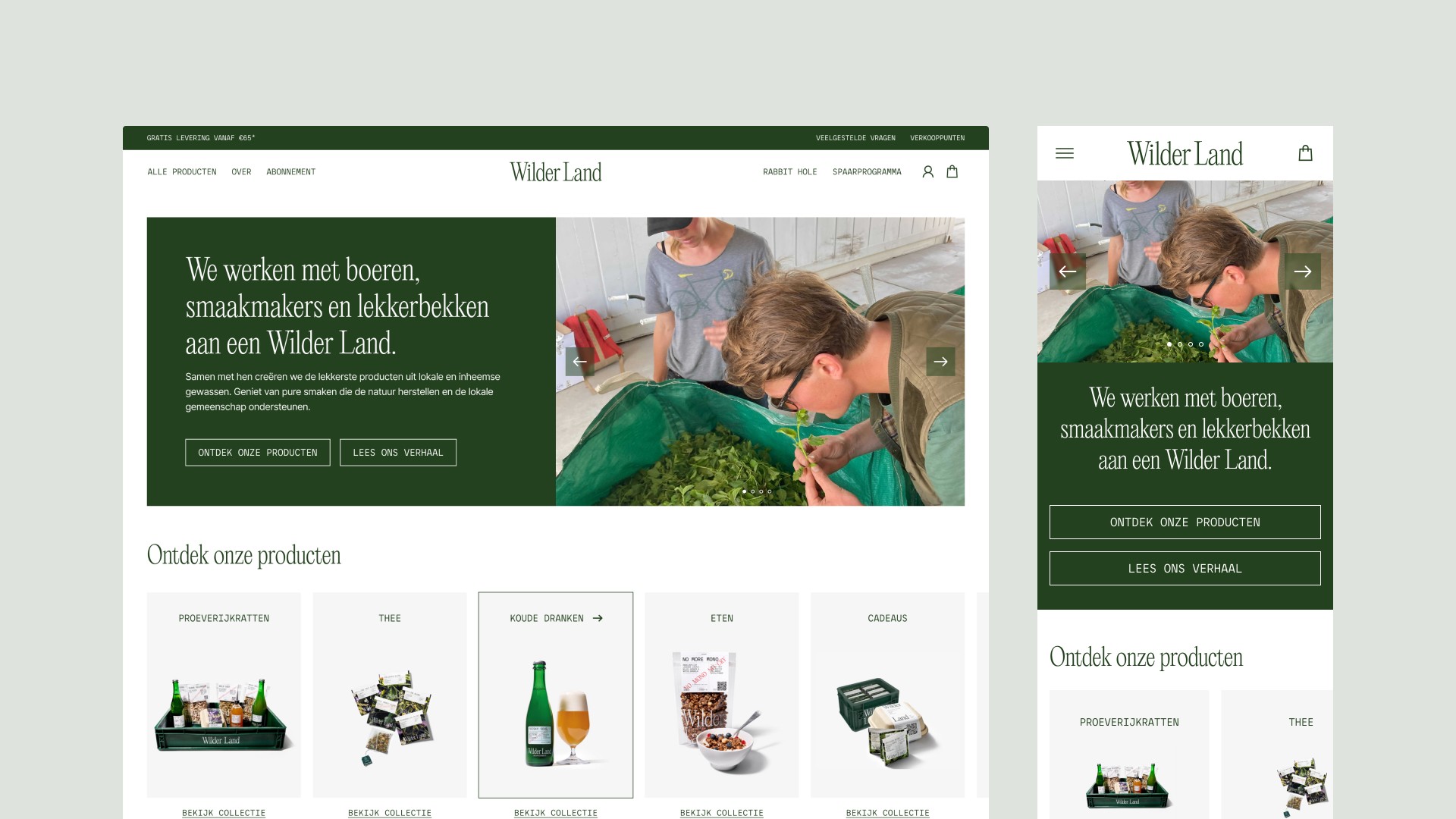
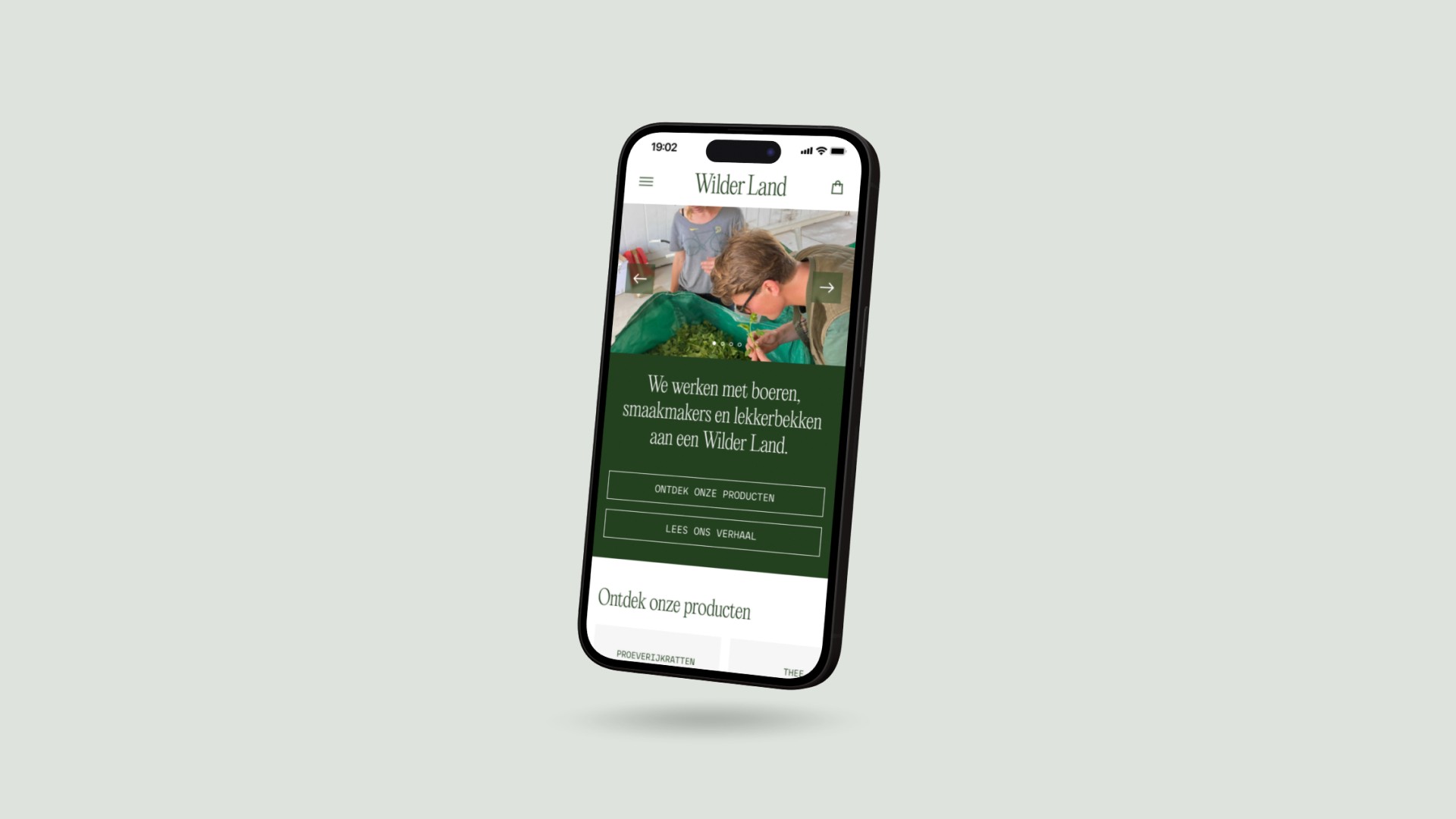
The homepage is where visitors first land on Wilder Land’s site. Clear navigation is crucial for guiding visitors. The redesign emphasized a clean layout aligning with Wilder Land's brand, simplifying product discovery and mission understanding. The updated navigation facilitates easy exploration of products, brand learning, and effortless information finding.
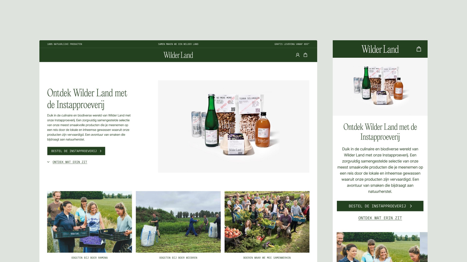
The original homepage featured a full-viewport hero section, now redesigned to preview the content below, nudging visitors to scroll down. Underneath the updated hero section, a new 'Explore our products' section promptly displays all product categories, making it easy for visitors to dive into Wilder Land’s offerings.
Product categories pages update
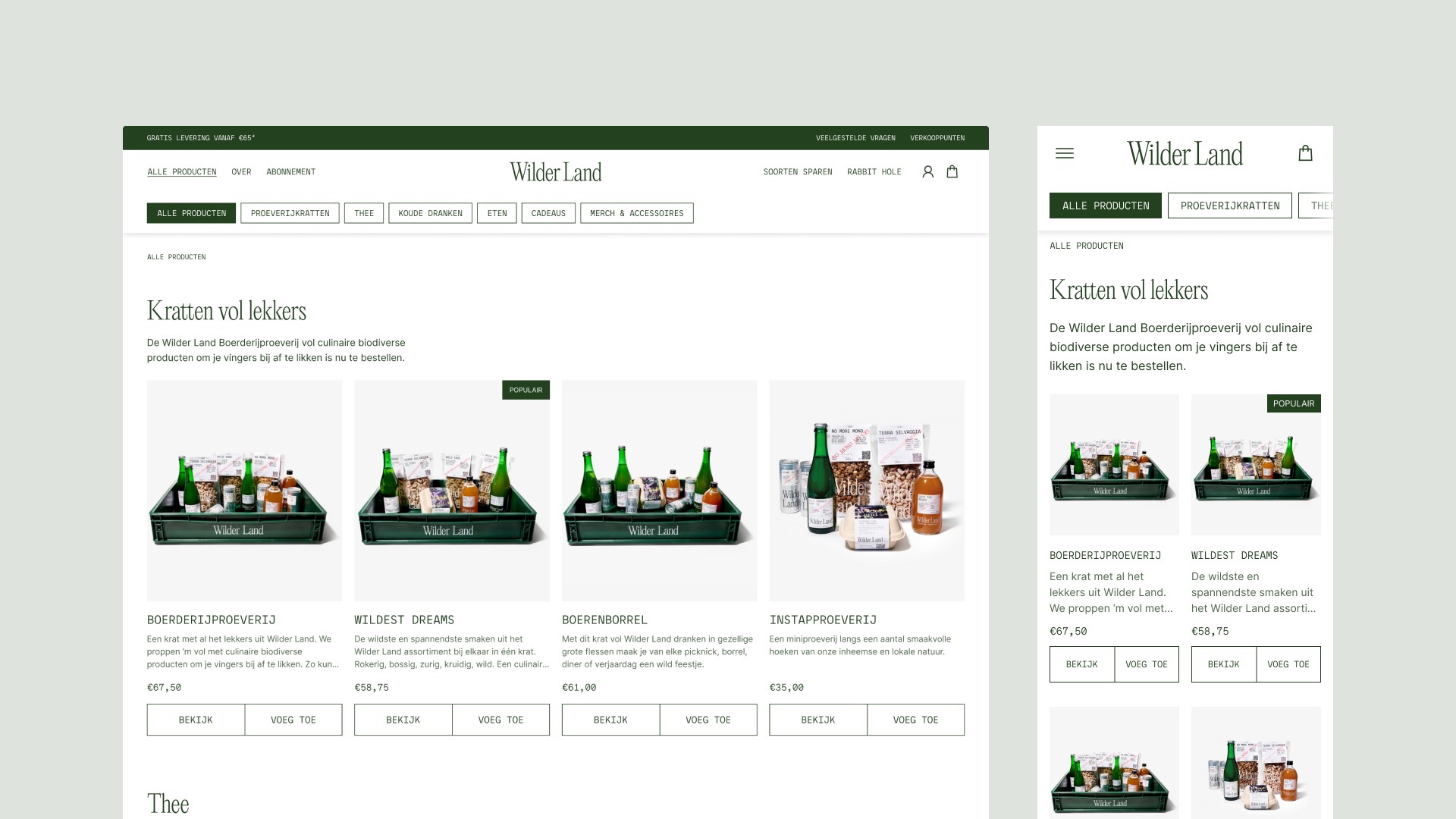
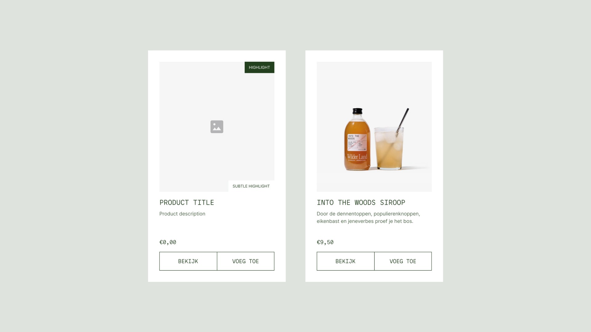
With an expanding product range, clear categorisation became crucial. The redesigned pages now facilitate effortless browsing and filtering, making the product discovery process engaging and straightforward. A key update was the redesign of the product-card component for consistency between the physical product and its online presentation. By aligning text to the left and allowing more whitespace around the product images, readability has improved and the images now have room to breathe, drawing more attention to the products themselves.
Footer update
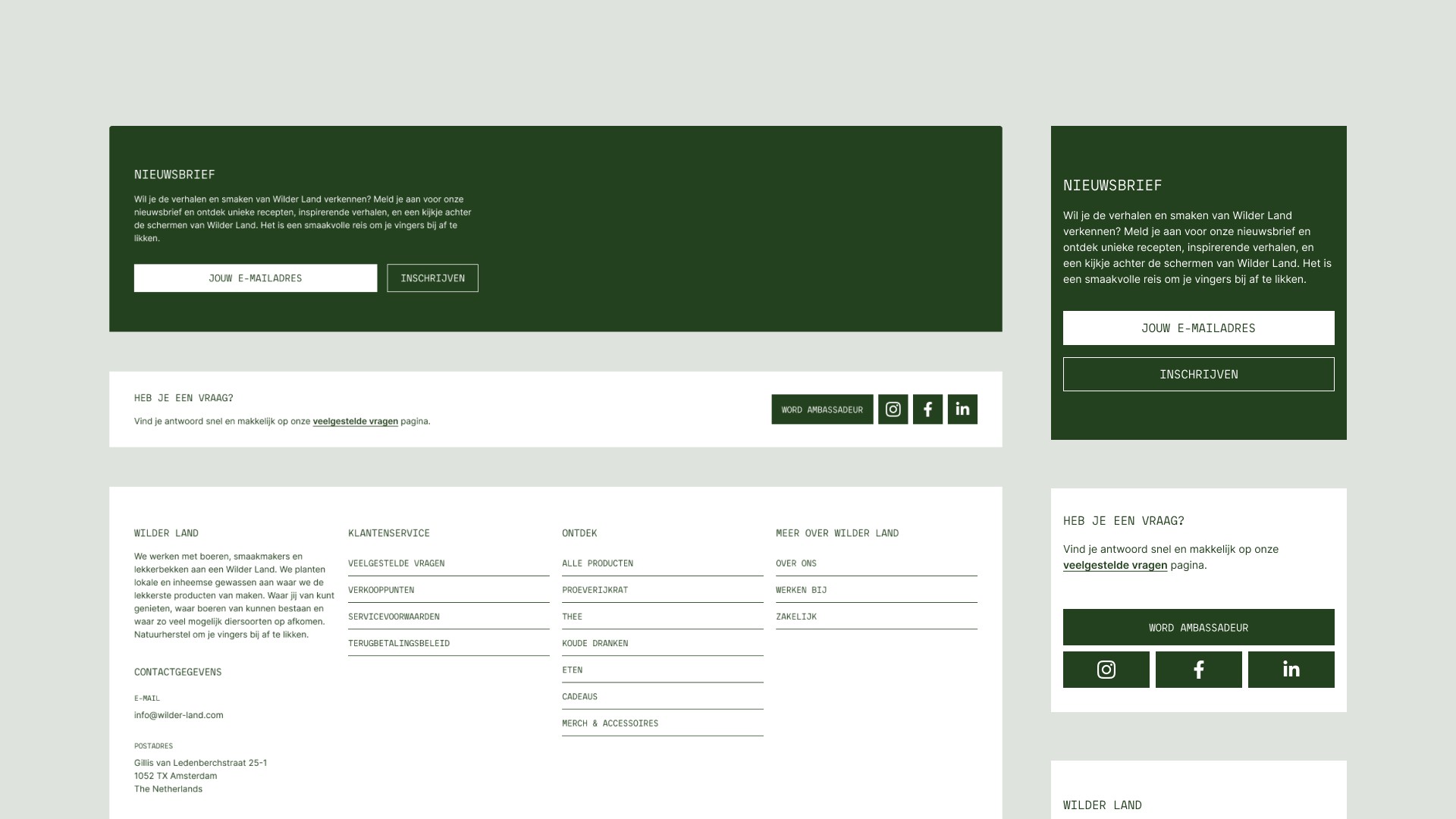
The footer not only extends the site’s navigation with additional links but now also emphasizes the newsletter sign-up, promoting more subscriber engagement for Wilder Land. The redesigned footer has a clean look, with essential links and a prominent newsletter section, which is now better positioned to capture visitor attention and encourage subscription, supporting Wilder Land's ongoing engagement with its community.
New landing page
At Wilder Land's request, a new landing page was created to spotlight campaigns or featured products. The design directs traffic effectively to highlighted items, offering a glimpse into Wilder Land’s mission and values.
Results
The updated designs, aimed at addressing the conversion rate dip, are set to go live soon. It's been gratifying to contribute solutions to such a heartfelt mission at Wilder Land. I'm looking forward to seeing the positive impact these changes will bring to both the user experience and the further growth of Wilder Land.

